Background: National City Transfer and Storage is a family owned and operated moving company founded in San Diego in 1949. NCTS moves families locally, nationally, and even internationally. The NCTS logo had not been updated in many years, and the company had no other marketing assets. I wanted to create more than just a singular logo, I wanted to deliver a package of marketing materials. My personal goal was to create a different feel for the company; a fresh new aesthetic that was both current and classic, yet different from the competition.
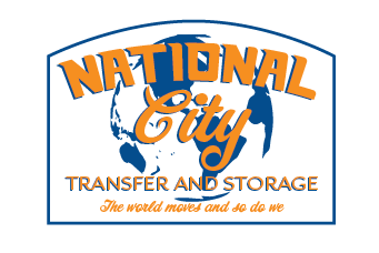
The previous logo can be seen below:
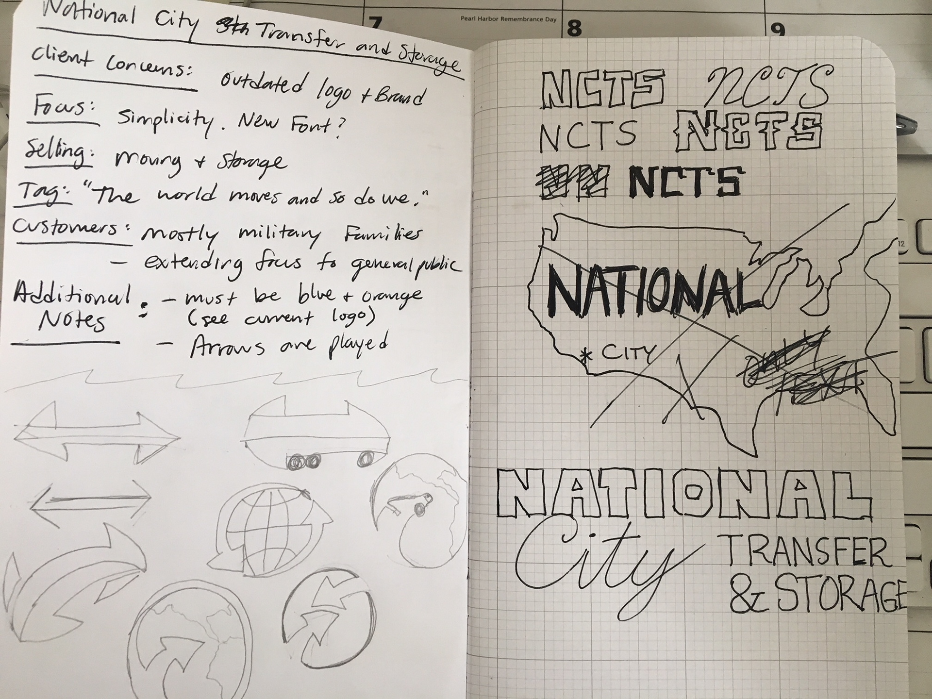
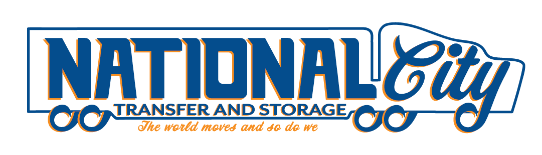
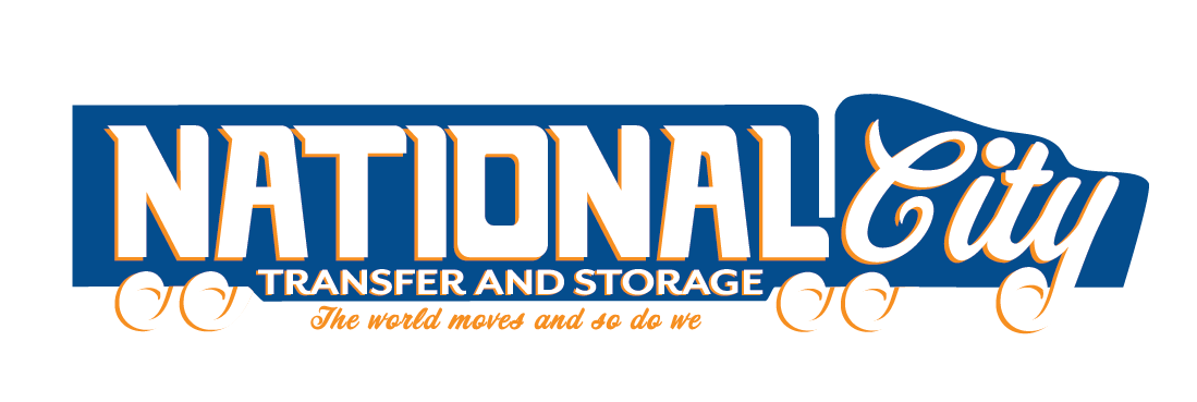
Goal: Maintain a clean and simple visual identity.
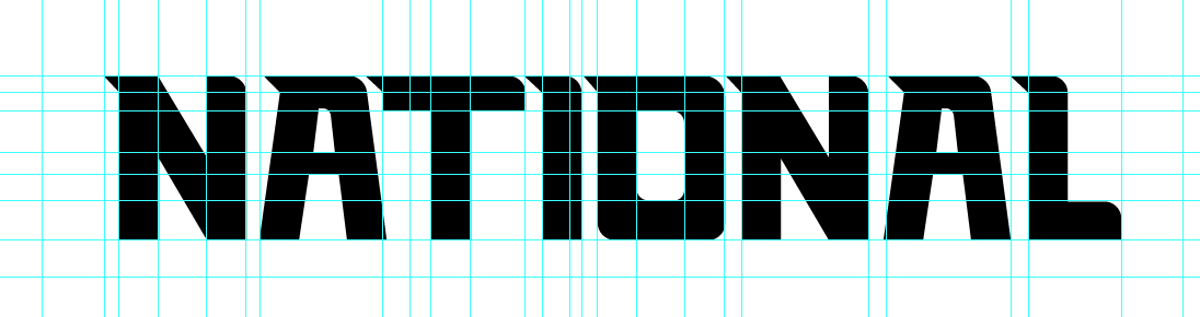
I tried to visualize what would catch my eye if I was driving on the freeway and I turned and saw a moving truck next to me. As I researched other moving companies, I noticed that most use Arrows to express movement. To differentiate, I created the National font, which has a dynamic feel, as if the top portion is being pulled back from the speed of the truck.
Thought Process: I felt that displaying "National" and "City" in two different fonts would give the logo and other marketing materials a broader appeal to potential customers. If I lived in Florida, do I know what or where National City is? By contrasting the two words, it creates juxtaposition and harmony; just as there are many different cities within the United States. All cities fall under the umbrella of the USA, but all cities have their own identity. "National" and "City" are both descriptions of where the company moves on larger (national) and smaller (local) scales.